
Pixel to REM Converter
Convert Pixels (px) to REM and REM to Pixels instantly. Customize your base font size and visualize typography inheritance in real-time.
Calculation Workspace
Standard browser root base is 16px. Drag or type to change.
Quick Reference Conversion Tables
These tables calculate dynamically based on your root base font size of 16px. Click copy icons on any row to extract standard design system guidelines.
Pixel to REM Reference Map
REM to Pixel Reference Map
Interactive CSS Inheritance Playground
Learn how REM and EM scale relative to different base elements. Modify settings below to watch font scaling visual elements react live!
html { font-size: 16px; }.parent { font-size: 1.5rem; }Computed value: 24px (16 × 1.5)
.child { font-size: 1.2em; }Computed value: 28.8px (24 × 1.2)
CSS Typography & Units Educational Guide
1 Pixel vs. Device Pixel vs. CSS Pixel
In web design, it's vital to distinguish between physical and logical units:
- Physical / Device Pixel: The actual hardware light emitter dots on the physical screen. For high-density Retina or AMOLED screens, one logical unit consists of 4 or 9 physical device pixels.
- Logical / CSS Pixel (px): An abstract reference unit defined by the W3C. 1 CSS pixel always represents 1/96th of an inch. Web design rules compile exclusively using CSS pixels, guaranteeing consistent layout layouts across resolutions.
2 What are REM and EM?
Both are relative CSS sizing units, but they derive their rendering anchors differently:
- REM (Root Element em): Scales relative to the font-size of the
<html>element. If the root size is 16px,2remis exactly 32px. Very predictable and safe for responsive grids. - EM (Element em): Scales relative to the font-size of its direct parent container. If a parent has a font-size of 20px,
1.5eminside that container equals 30px. Ideal for labels or paddings.
3 Best Practices: Pixel vs. REM vs. EM
Pixel (PX) — Absolute Sizing
Use for absolute dimensions that should never scale, such as border widths, thin box-shadows, image boundaries, and fixed-width dividers.
REM — Root-Relative Sizing
Use for body typography, paragraph text, headings, layout columns, outer spacing margins, and main paddings. This guarantees the entire site responds gracefully to user browser preferences.
EM — Local-Relative Sizing
Use inside isolated modular widgets (like menus, sliders, modals) for sizing icons, button paddings, or labels. When the component's base font size scales, the entire component scales proportionally.
4 Mathematical Conversion Formulas
5 Real-World CSS Nesting & Compound Sizing
Below is a practical code example illustrating nested typography. Note how REM remains independent of nesting, whereas EM compounds exponentially relative to parent elements:
html {
  font-size: 16px; /* Base Root */
}

.card {
  font-size: 1.25rem; /* 1.25 × 16px = 20px */
  padding: 1.5rem; /* 24px padding (rem is stable) */
}

.card-title {
  font-size: 1.5em; /* 1.5 × 20px = 30px (scales with parent) */
  margin-bottom: 0.5em; /* 0.5 × 30px = 15px (relative margins) */
}

.card-desc {
  font-size: 0.875rem; /* 0.875 × 16px = 14px */
}Example Heading (.card-title)
This paragraph represents card body text (styled in rem). If you scale the parent font size, this remains aligned, while EM headings adjust relatively.
Overview & Capabilities
Converting pixels into root-relative REM units transforms static Figma vectors and Sketch artboard dimensions into scalable CSS. In frontend architecture and Tailwind CSS spacing systems, hardcoded pixel values break responsive user magnification. Dividing design mockup pixels by the root font base (standard 16px) produces fluid rem tokens that adapt seamlessly across mobile and desktop displays.
How to Use
font-size: 1.5rem;) directly into your stylesheet.Key Features
Common Use Cases
Tips & Best Practices
Related Tools

Bytes to Bits Converter
Convert bytes to bits (B to b) instantly. Calculate cryptographic key lengths, memory buffer alignment, SHA-256 bitwidths, and raw bit streams.
Data Storage Converter
Convert between Kilobytes (KB), Megabytes (MB), Gigabytes (GB), and Terabytes (TB). Calculate SSD drive capacities, cloud quotas, and digital file sizing.
Data Speed Converter
Convert between Kbps, Mbps, Gbps, and Tbps network bitrates. Calculate fiber optic bandwidth, 4K streaming buffer requirements, and server throughput.
Bits to Bytes Converter
Convert bits to bytes (b to B, Mb to MB, Gb to GB) instantly. Calculate actual file download speeds from advertised internet service provider bitrates.
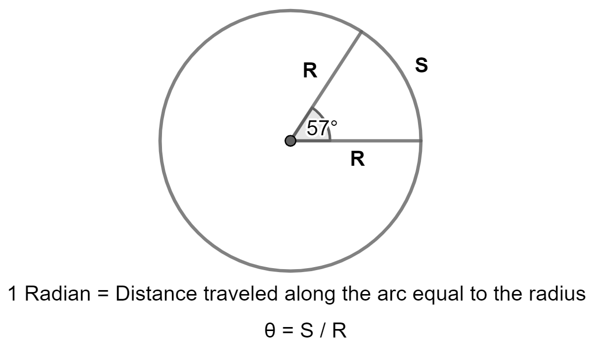
Radians to Degrees Converter
Convert radians to degrees (rad to deg) instantly with π fraction support. Calculate angles for calculus, trigonometry, harmonic waves, and orbital mechanics.

Power Converter
Universal power converter for Watts (W), Kilowatts (kW), Horsepower (HP), BTU/hr, and Tons of Refrigeration. Calculate HVAC AC cooling loads and electrical capacity.
Frequently Asked Questions
Q What is 24px in rem with 16px base?
24px equals 1.5rem (24 ÷ 16).
Q What is 32px in rem?
32px equals 2.0rem with a standard 16px base.
Q What is 14px in rem?
14px equals 0.875rem.
Q Why should I use REM instead of PX in CSS?
REM units scale proportionally when users adjust their browser font size settings, ensuring accessibility compliance under WCAG 2.1.